Plot

pip install kpireport-plot
Plot
The Plot is a simple workhorse View for displaying a variety of
timeseries data. It is designed to be compatible with several Datasources and
handle most KPI graphs, which tend to plot only a single metric or perhaps
a set of related metrics. It utilizes matplotlib under the hood.
Show/hide example configuration YAML
views:
   new_signups:
      plugin: plot
      title: New signups
      args:
         datasource: users_db
         kind: bar
         query: |
            select
               date_format(created_at, '%%Y-%%m-%%d') as time,
               count(*) as daily_total
            from signups
            where created_at >= {from} and created_at < {to}
            group by day(created_at)
         query_args:
            parse_dates:
               time: '%Y-%m-%d'
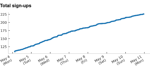
A simple line plot from MySQL data
Single stat
Sometimes it is useful to only show one number, and a fine-grained trend of the number is less important; in this case, you can use a “single stat” view, which is included as part of the Plot plugin for convenience.
Show/hide example configuration YAML
views:
   new_signups:
      plugin: single_stat
      title: New signups
      args:
         datasource: users_db
         query: |
            select count(*)
            from signups
            where created_at >= {from} and created_at < {to}
         comparison_query: |
            select count(*)
            from signups
            where created_at >= date_sub({from}, {interval})
               and created_at < {from}
         comparison_type: percent
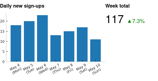
An example of a plot view combined with a single stat view
API
- class kpireport_plot.Plot(report: Report, datasources: kpireport.datasource.DatasourceManager, **kwargs)
Bases:
kpireport.view.ViewRender a graph as a PNG file inline.
The
matplotlibmodule handles rendering the plot. The Plot view sets a few default styles that make sense for plotting timeseries data, such as hiding the x-axis label and setting up date formatting for the x major labels.Expected data formats
The Plot plugin can work for many different types of queries and Datasources, as long as a few properties hold for the response:
The returned table should ideally only have two columns: one for the time, and one for the value of the metric at that time.
If the table has more than two columns, it is assumed that each column is a separate series and will be displayed as such, unless
groupbyis used.
Example of valid two-column result table:
time
value
2020-01-01
1.0
2020-01-02
1.2
2020-01-03
2.1
Example of valid three-column result table:
time
value_a
value_b
2020-01-01
1.0
0.4
2020-01-01
3.2
0.2
2020-01-02
1.2
0.2
2020-01-02
2.7
0.7
Example of valid three-column result table, where
groupby: countrywould cause the data to be segmented according to thecountrycolumn:time
value
country
2020-01-01
1.0
USA
2020-01-01
3.2
Germany
2020-01-02
1.2
USA
2020-01-02
2.7
Germany
- datasource
ID of Datasource to fetch from.
- Type
str
- query
the query to execute against the Datasource.
- Type
str
- query_args
additional arguments to pass to the query function. Some Datasources may support additional parameters.
- Type
dict
- time_column
the name of the column in the query result table that contains timeseries data. (Default
"time")- Type
str
- kind
the kind of plot to draw. Currently only “line”, “bar”, and “scatter” are supported. (Default
"line")- Type
str
- stacked
whether to display the line/bar graph types as a stacked plot, where each series is stacked atop the last. This does not have any effect when rendering scatter plots. (Default
False)- Type
bool
- groupby
the name of the column in the query result table that should be used to group the data into separate series. (Default
None)- Type
str
- bar_labels
whether to label each bar with its value (only relevant when kind is “bar”.) (Default
False)- Type
bool
- xtick_rotation
how much to rotate the X labels by when displaying.
- Type
Union[int, str]
- plot_rc
properties to set as
matplotlib.RcParams. This can be used to customize the display of the output chart beyond the defaults provided by the Theme.- Type
dict
- post_plot(ax, df=None, index_data=None, series_data=None)
A post-render hook that can be used to process the plot before outputting.
Subclasses of the Plot class can override this to add, e.g., annotations or otherwise tweak the final plot output.
- class kpireport_plot.SingleStat(report: Report, datasources: kpireport.datasource.DatasourceManager, **kwargs)
Bases:
kpireport.view.ViewDisplay a single stat and optionally a delta.
- datasource
the ID of the Datasource to query.
- Type
str
- query
the query to execute agains the Datasource.
- Type
str
- label
a templated label that can be used to change how the stat is rendered. A
{stat}template variable will be filled in with the stat value. (Default"{stat}")This can be used to create arbitrary other rendered output, e.g.:
# Add a separate link element
label: |
  {stat} <a href="https://example.com">More</a>
- Type
str
- link_url
a hyperlink URL to open if the viewer clicks on the rendered output. The link wraps the entire display. (Default
None)- Type
str
- comparison_query
an optional query to use as a comparison value. If defined, the current stat will be displayed, and the delta between the stat obtained via the comparison query will be shown next to it. (Default
None)- Type
str
- comparison_type
how to show the delta; possible values are “raw”, meaning the raw difference between the two values is displayed, or “percent”, meaning the percentage increase/decrease is displayed. (Default
"raw")- Type
str
Changelog
0.2.1
Bug Fixes
Plots will now be clipped on the x-axis to the report window.
0.2.0
New Features
Plots now support a
label_mapoption, which maps series names (column names) to some text value. This can be used to make nicer, more readable legends.
The Plot class now defines a
post_plotfunction. This is called directly after running most of the plot logic, but before rendering the final output. It is a good place to modify legends or add additional presentation to the plot output. The intention is that a plugin could subclass Plot and provide some additional hooks here.
Bug Fixes
When trying to plot DataFrames with multiple non-numeric columns, the plotter will now log a warning and drop the non-numeric columns. Non-numeric columns should be grouped over, not plotted.
0.1.2
Bug Fixes
Fixes issue where stacked line graphs would not render properly in some cases.
0.1.1
Bug Fixes
Fixes an issue where non-grouped data with multiple columns would only have the first series plotted, and no legend would be auto-applied.
0.1.0
New Features
Adds a new
groupbyconfiguration parameter, allowing grouping of the queried data on some arbitrary column or columns. This replaces the old “auto-grouping” mechanism, which was a bit buggy and not well-suited to all shapes of data.
0.0.1
Prelude
Initial commit.
New Features
Initial commit.